Introduction: Users Are Busy. Your App Shouldn’t Be.
It’s 2025. People use apps:
- While commuting
- While eating
- While watching Netflix
- Even while walking their dog
Your users are multitasking — so your UX must be one-hand friendly.
If your app requires two hands to navigate, it’s already losing users.
Because in today’s fast-paced world, convenience = retention.
Let’s explore how to design apps that are effortless to use — even with just a thumb.
Why One-Hand UX Matters More Than Ever
Mobile devices are getting bigger — but hands are not.
A study in 2025 shows:
- 61% of users operate their phones one-handed most of the time
- Apps with poor one-hand UX see higher bounce rates and uninstalls
- E-commerce apps with accessible UIs convert 18–25% higher on mobile
If your CTA is in the top corner, you’ve already lost the sale.
6 Best Practices for One-Hand Mobile UX
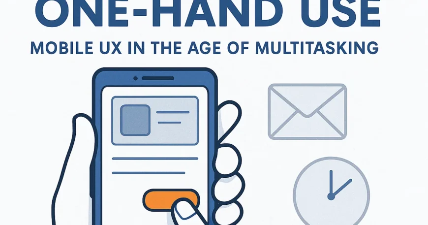
1. Design Within the Thumb Zone
The thumb zone is the area that users can comfortably reach with one hand.
Keep key actions — like:
- Navigation
- Add to cart
- Like/share
— within this zone (usually the bottom half of the screen).
Avoid placing important buttons in unreachable top corners.
2. Bottom Navigation Is Your Best Friend
Ditch the top tabs.
Use bottom navigation bars with 3–5 core actions.
Use icons with labels, not just symbols, for faster recognition.
Bonus: This also works great for PWA designs.
3. Swipe Gestures Over Taps
Swiping is faster and more natural in one-hand mode.
Examples:
- Swipe to delete
- Swipe left to view more
- Bottom sheets that slide up instead of full-page transitions
Gesture-first design = smoother multitasking.
4. Use Floating Action Buttons (FABs) Smartly
FABs offer quick access to primary actions.
Place them on the lower right (for right-handers) or make them draggable for accessibility.
Think:
- “Add to Cart”
- “Start Chat”
- “Scan Now”
5. Keep Inputs Short & Smart
Typing with one thumb is slow.
Improve forms by:
- Using input masks
- Auto-suggestions
- Voice or number input where possible
Every second saved = higher conversions.
6. Support One-Hand Mode in Settings
Advanced apps now offer a dedicated one-hand layout in settings.
Think:
- Shifted UI elements
- Compact view
- Reachability features
A thoughtful touch for accessibility-conscious brands.
Real Use Case: One-Hand UX Boosts Conversion
We recently helped a ThinkDebug client (a grocery delivery startup) rework their checkout UX:
- Moved actions to thumb zone
- Replaced top nav with bottom bar
- Enabled one-tap repeat orders
Result?
Conversion rate increased by 34% within 3 weeks — with zero additional ad spend.
It Matters for Founders & Product Owners
If you’re launching or scaling an app in 2025, don’t just ask:
“Does it work?”
Ask:
“Can users do this while holding a coffee in one hand?”
Because in a world full of distractions, your app must be:
- Effortless
- Intuitive
- And thumb-friendly
How ThinkDebug Designs for Real Life
At ThinkDebug, we design mobile apps that:
Prioritize one-hand UXDeliver fast, smooth navigation
Maximize engagement through better usability
Whether it’s a shopping app, a service tool, or a digital product — we help you create experiences that users want to come back to.
Final Thought
Don’t make your users work harder than they need to.
Design smart. Design simple. Design for one hand.
Because in the age of multitasking, the easier your app is to use, the more successful it becomes.
📞 Call to Action
Want to optimize your app for today’s mobile users?
Let ThinkDebug redesign your UX — so your app works even when your users are holding a chai in one hand.

